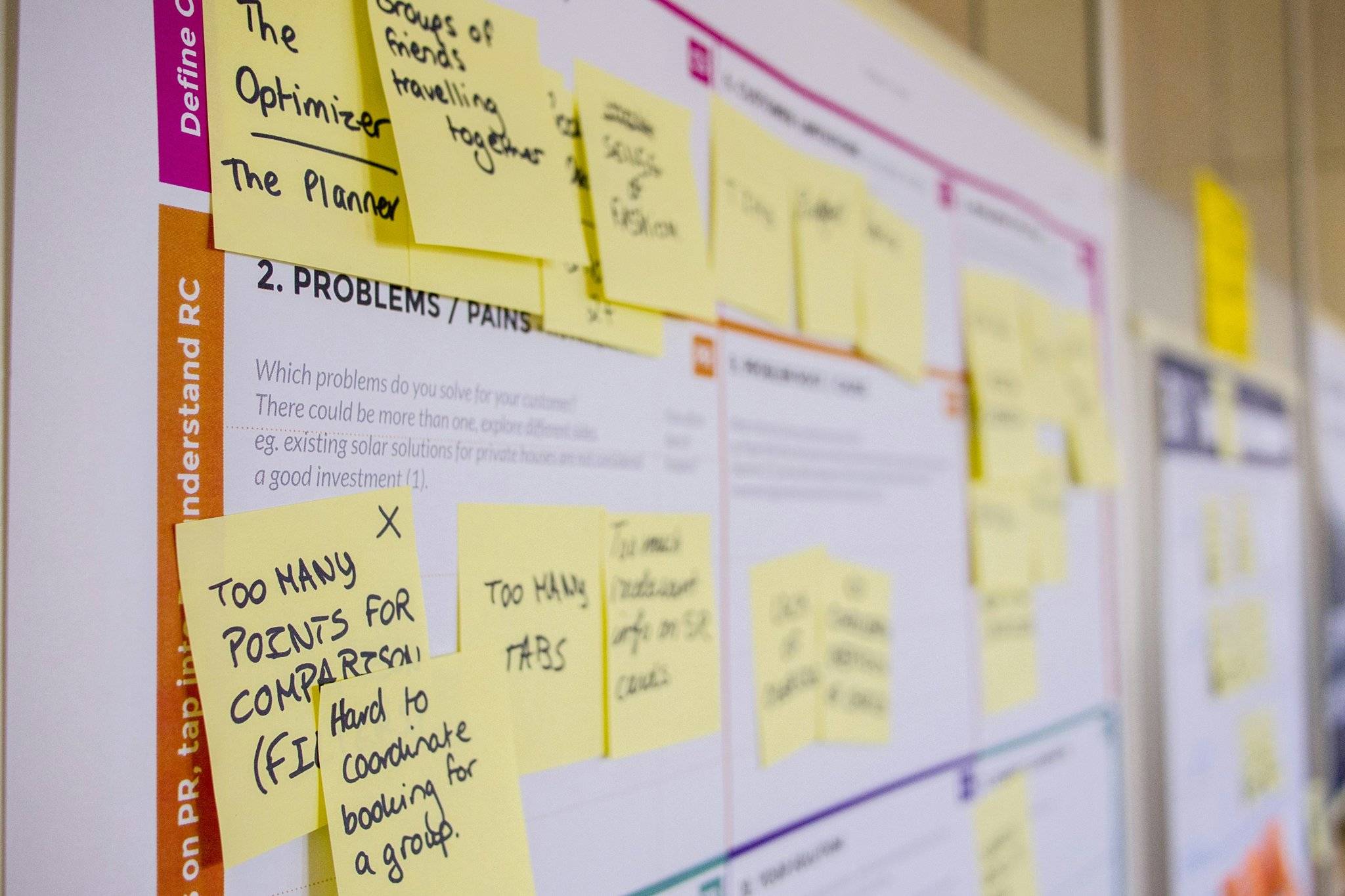
Ever stared at two streaming analytics dashboards, wondering which one will save you from decision paralysis? Yeah, same. When it comes to choosing the right tool for analyzing those viewer engagement stats, your user interface (UI) can either be your best friend or your biggest headache.
In this guide, we’re diving deep into the chaotic, nerdy world of streaming analytics UIs. You’ll learn why some dashboards make you feel like Tony Stark in an Iron Man suit, while others leave you questioning your career choices. Plus, we’ll cover actionable steps, brutal honesty about bad interfaces, and—because why not—a haiku at the end. Let’s get started.
Table of Contents
- Problem Background: Why User Interface Matters
- Step-by-Step Guide to Comparing Streaming Analytics UIs
- Tips & Best Practices for Picking the Right UI
- Real-World Examples of Good vs. Bad Interfaces
- Frequently Asked Questions About User Interface Comparison
Key Takeaways
- A well-designed streaming analytics UI saves time and improves decision-making.
- Poorly designed UIs cause confusion, missed insights, and unnecessary stress.
- Use criteria like customization, simplicity, and accessibility to compare tools effectively.
- Tools like Tableau, Looker, and Google Data Studio have distinct strengths depending on use cases.
- Your ideal UI depends on your team’s technical skill level and specific goals.
Problem Background: Why User Interface Matters
Let me set the stage with a confession: I once spent six hours trying to find “average watch time” in a poorly designed streaming dashboard. Spoiler alert—I gave up and googled how to cry productively instead. The problem? It wasn’t just cluttered—it was unintuitive. Buttons were everywhere, labels made no sense, and there was zero guidance on where to even start.

This isn’t just my story—it’s a universal pain point. A recent industry report found that 78% of media professionals struggle with navigating complex analytics platforms. That’s right, nearly 8 out of 10 people are stuck fumbling through drop-down menus and scattered charts when they should be gleaning actionable insights instead.
Streaming analytics is crucial for understanding viewer behavior, optimizing content delivery, and boosting ROI. But none of that matters if your UI looks like it was designed by someone who lost a bet. So let’s fix this mess together.
Step-by-Step Guide to Comparing Streaming Analytics UIs
To avoid another existential crisis over metrics, follow these steps:
Step 1: Evaluate Customization Options
Optimist You: “I want widgets galore!” Grumpy Me: “Widgets don’t matter if they slow down performance.” True customization means being able to tailor the layout without sacrificing usability. Does the platform allow drag-and-drop functionality? Are filters easy to apply?
Step 2: Test Navigation Simplicity
Can you easily move between tabs? How does the search bar work? If you need three PhDs and a divining rod to navigate the interface, cross it off your list. For example, Tableau offers smooth navigation but might overwhelm beginners due to its advanced features.
Step 3: Assess Visual Appeal and Readability
Sensory overload alert! If the colors clash so hard it feels like staring directly at the sun, run. On the flip side, minimalist designs can also fail if critical elements are buried under layers of whitespace. Tools like Google Data Studio strike a nice balance here.

Step 4: Check Mobile Responsiveness
Sounds crazy, but trust me—you WILL check analytics during a coffee break or conference call. Ensure the dashboard adapts seamlessly to smaller screens without requiring endless pinching and zooming.
Step 5: Review Collaboration Features
Is it easy to share reports? Can multiple users collaborate in real-time? Platforms like Looker excel here, offering robust sharing options that integrate smoothly with Slack and email.
Tips & Best Practices for Picking the Right UI
- Start Simple: Don’t fall prey to shiny object syndrome. Focus on core functionalities first.
- Trial Before Commitment: Most platforms offer free trials. Take advantage!
- Prioritize Accessibility: Colorblind users hate overly colorful dashboards as much as audiophiles loathe MP3 files. Opt for inclusive design.
- Beware Vendor Lock-In: Be cautious of proprietary formats that lock you into one ecosystem forever.
Real-World Examples of Good vs. Bad Interfaces
Success Story: Netflix’s Use of Looker
Netflix uses Looker to analyze massive amounts of data related to viewer preferences and engagement. Their success stems largely from Looker’s intuitive UI, which allows non-techies to slice and dice data effortlessly. The result? More personalized recommendations and happier viewers.

Flop Story: A Startup’s Dashboard Disaster
A nameless startup once invested heavily in a custom-built analytics tool only to realize too late that their designers skipped UX testing entirely. Employees referred to using the dashboard as “fighting a hydra.” Lesson learned: Always beta-test before full deployment.
Frequently Asked Questions About User Interface Comparison
What makes a good streaming analytics UI?
A good UI combines aesthetics, functionality, and ease of use. It should prioritize clarity, enable quick access to key metrics, and adapt to various devices.
Which tool has the best UI for beginners?
Google Data Studio is often recommended for newcomers thanks to its straightforward setup and extensive tutorials.
Why do mobile-responsive UIs matter?
With remote work now standard, having a mobile-friendly dashboard ensures flexibility and uninterrupted access to vital data.
Conclusion
Choosing the right streaming analytics UI boils down to knowing what works best for YOUR needs. Whether you opt for sleek minimalism à la Google Data Studio or powerhouse versatility like Looker, remember this golden rule: Less whirrrr, more wow.
And hey, if all else fails:
Data flows fast,
Insights hide behind clicks,
Find the right UI.


