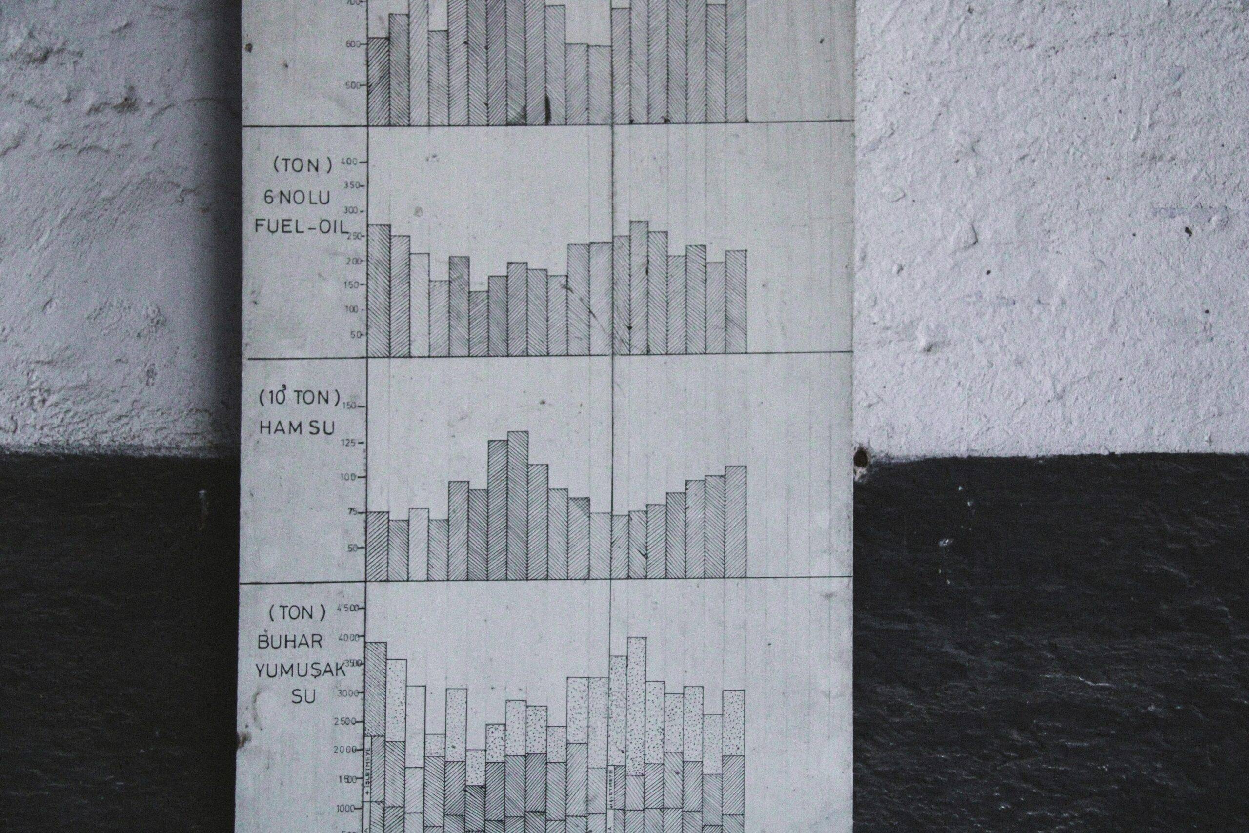
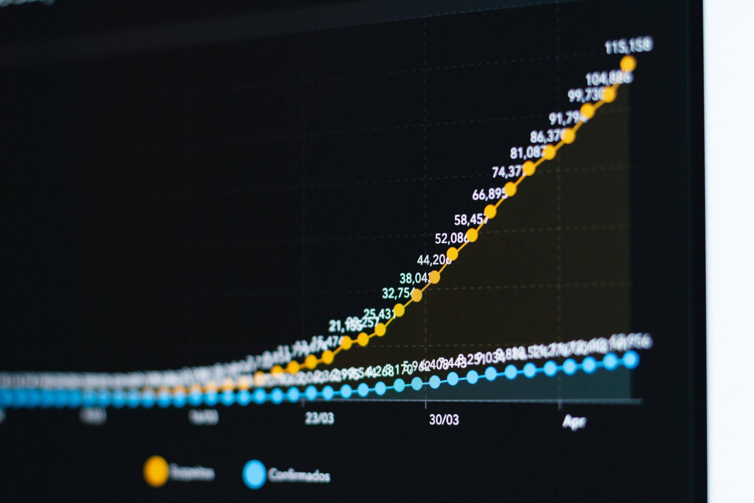
Ever stared at two streaming platforms’ analytics tools, wondering which one is actually better? Yeah, us too. And trust me, you’re not alone. Choosing the right streaming analytics tool without clear comparisons feels like trying to edit a 4K video on a laptop from 2009—painful and frustrating.
In this guide, we’ll break down why Feature Comparison Charts are crucial for making informed decisions in streaming analytics. You’ll learn how to read them, build your own, and use them to crush your competition (or just get some peace of mind).
Table of Contents
- Key Takeaways
- Section 1: The Big Problem with Streaming Analytics Tools
- Section 2: How to Build Killer Feature Comparison Charts
- Section 3: Best Practices for Using Feature Comparison Charts
- Section 4: Real-World Examples That Prove Their Value
- FAQs: All Your Burning Questions About Feature Comparison Charts
Key Takeaways
- Feature Comparison Charts simplify decision-making by highlighting key differences between tools.
- Poorly designed charts can mislead users—be wary of overly complex data dumps.
- DIY charts ensure relevance but require careful planning and testing.
- Successful companies leverage these charts to save time and resources while improving ROI.
The Big Problem with Streaming Analytics Tools
“Optimist You:” “There are so many great streaming analytics options—this will be fun to explore!”
“Grumpy You:” “Ugh, fine—but only if coffee’s involved.”
And there’s the rub. With dozens of streaming analytics platforms offering everything from audience segmentation to real-time tracking, it’s easy to feel overwhelmed. I once spent three hours comparing heatmaps on two tools just to realize later neither was compatible with my existing CRM. Talk about wasted effort!
Enter Feature Comparison Charts. These visual gems cut through marketing fluff and focus solely on what matters: functionality. But let’s back up first—why is choosing the wrong tool such a disaster?

Fig. 1 – Overwhelmed by choices? It happens to the best of us.
How to Build Killer Feature Comparison Charts
Ready to take control? Here’s a step-by-step guide:
Step 1: Define Your Key Metrics
Not all features matter equally. Start with the metrics that align with your goals, such as:
- Audience retention rates
- Engagement patterns
- Content performance
Pro Tip: Don’t fall into the trap of overloading your chart with every single metric under the sun. Stick to 5–7 core ones.
Step 2: Research Competitors’ Offerings
Visit competitor websites, watch tutorials, or even trial their software. For example, did you know Tool A offers geolocation insights while Tool B focuses more on behavioral trends?
Step 3: Choose a Format That Works
Whether it’s tables, bar graphs, or pie charts, pick formats that convey information quickly. Avoid anything flashy or overly complicated—it’s a recipe for confusion.

Best Practices for Using Feature Comparison Charts
- Stay Objective: Always prioritize facts over biases. Even if Tool X is your favorite, don’t skew the data in its favor.
- Keep It Simple: Too much detail clutters the message. Aim for clarity above all else.
- Use Consistent Scoring: Establish a rating system (e.g., stars, percentages) so readers can easily compare across rows.
Warning: One terrible tip floating around suggests using different scoring scales for each product. Just… don’t do it. Ever.
Real-World Examples That Prove Their Value
Take Netflix, for instance. They famously used feature comparison tables internally when deciding whether to invest in predictive algorithms versus manual curation methods. Guess which won? Spoiler alert: Algorithms crushed it.
Or consider Spotify. By carefully evaluating third-party analytics integrations using feature charts, they improved playlist recommendations, driving higher user engagement.

FAQs: All Your Burning Questions About Feature Comparison Charts
Q: Do I really need to create my own chart?
Absolutely. Pre-made charts might miss niche-specific details crucial to your business needs.
Q: What software works best for creating these charts?
Tools like Excel, Google Sheets, or Canva are excellent starting points. Advanced users may prefer Tableau or Power BI.
Q: Are there any downsides to relying heavily on these charts?
Yes, obsession with comparisons can lead to analysis paralysis. Balance logic with intuition.
Conclusion
To sum it up, Feature Comparison Charts are indispensable for navigating the chaotic world of streaming analytics. From simplifying tough decisions to revealing hidden competitive edges, they keep you grounded in reality rather than drowning in hype.
Now go forth and conquer those analytics mountains—but hey, maybe grab another cup of coffee before diving in. 😉
Like a Tamagotchi, your SEO strategy thrives on consistent care and feeding. Keep tweaking those charts until they’re just right.


